LA Rams Unveil New Logo to Reception of Mocking, Disbelief
The Los Angeles Rams have unveiled a brand-new logo and some familiar new colors ahead of a milestone season.
The Rams’ primary colors are royal blue and yellow again after the franchise’s rebranding announcement, which was made Monday with rather less fanfare than the team originally hoped because of the coronavirus pandemic.
The Rams’ new primary logo features an “LA” with a ram’s horn curved around the letters, while a new secondary logo is a modern update of the classic ram’s head logo occasionally used by the team in previous decades.
The ??? ??????? Rams pic.twitter.com/qyspVxoHWX
— Los Angeles Rams (@RamsNFL) March 23, 2020
With new uniforms coming up later in the year, the Rams are finally getting their long-awaited new look before the fifth season of the franchise’s return to Los Angeles.
The team is making changes in conjunction with the opening later this year of SoFi Stadium, Rams owner Stan Kroenke’s multibillion-dollar arena complex in Inglewood, California.
“It blends the best of our past with what we believe is the best of our future,” Rams chief operating officer Kevin Demoff said.
Demoff said the Rams’ uniforms will be unveiled at some point between the draft and training camp, but it seems clear they will be wearing bold versions of the classic colors beloved by their Los Angeles fans. It also seems clear the Rams’ famous horned helmets — the first helmet logo in football history — aren’t going anywhere.
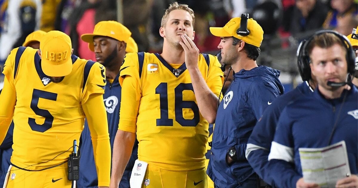
The Rams’ primary colors were royal blue and gold for most of their first tenure in Los Angeles, and the new versions are saturated. The new royal blue is a rich shade dubbed “Rams Royal,” while its complement is a vibrant yellow dubbed “Sol.”
The colors are almost certain to be welcomed by Rams fans. The primary logo will be a harder sell, as the Rams unfortunately learned two weeks ago.
An altered, incorrectly colored version of the Rams’ new logo was mostly eviscerated online when a photo of an NFL draft night hat bearing the logo was posted on Reddit.
The draft hat was stylized to feature green Vegas-style neon colors instead of the proper team colors, and the logo was elongated in a way that made the ram’s horn look more like a lightning bolt — which happens to be the primary symbol of the crosstown Los Angeles Chargers, who will share SoFi Stadium with the Rams.
“The detail, the nuance and all the colors were wrong,” Demoff said. “It was a terrible first introduction to where we’re headed.”
In the actual logo, the ram’s horn looks less like a bolt and much more like an ocean wave, which is what its designers planned. The Rams wanted a prominent use of “LA” in their new logo to celebrate and to cement their return to the West Coast, Rams creative director Cory Befort said.
The logo also contains three different shades of yellow, including an almost-orange shade that will be an accent color for the Rams. Color gradients traditionally aren’t used in sports teams’ logos, but Befort said the team added it to create a distinctive look that can be captured and mass-produced by modern printing equipment.
Despite those changes, many on social media were unimpressed.
— Ron Wellington (@ronology2_) March 23, 2020
I’ve said it once and I’ll say it again @RamsNFL spend Billions of dollars on a new state of the art stadium and go shopping at the 99 cents only store for a new logo. I’m still and will always be a Diehard Rams fan “But” I’m not buying that logo
— JoeSilverFoxRamirez (@JoeRamsilverfox) March 23, 2020
— Josh Cashman (@CableThanos_) March 23, 2020
You actually saw the feedback from the leak and still made a big deal about this trash lmao your poor fans
— Three Time Timmy (@tim_bucher) March 23, 2020
first Todd Gurley, now this… do y’all not want fans???
— mike 8/24 (@MikeMAACC) March 23, 2020
The new LA Rams logo.
Looks like something from a flag football team. pic.twitter.com/RHyj7kAGRu
— ?????? (@Trxnzition) March 23, 2020
After using a profile drawing of an angry cartoon ram as their primary logo for years, a minimalist version of a ram’s head is now a secondary logo. Befort called it “a modern take on the classic skull.”
Gold and royal blue became the team’s primary colors during its second year of existence in Cleveland in 1938, and they stayed when the franchise moved to Los Angeles in 1946.
The Rams used a blue-and-white color scheme in their uniforms and logos from 1964 until 1973, when owner Carroll Rosenbloom brought back gold.
For the sixth season of the Rams’ tenure in St. Louis in 2000, they changed colors to a duller blue and a dingier tan-gold hybrid that never seemed to appeal to Los Angeles fans when Kroenke brought the franchise back in 2016.
The Rams have worn blue-and-gold throwback uniforms and versions of their blue-and-white vintage uniforms frequently during their second tenure in Los Angeles, when their style has been a mishmash of past and present looks.
The team largely used a blue-and-white color scheme for most of their signage and promotional material over the past four years, making many fans suspect gold would be dropped again from the Rams’ look.
Demoff said that was never a possibility: Blue and gold are indelibly linked with the Rams.
“That was one place we knew our fans weren’t going to compromise,” he said.
The Western Journal has reviewed this Associated Press story and may have altered it prior to publication to ensure that it meets our editorial standards.
Truth and Accuracy
We are committed to truth and accuracy in all of our journalism. Read our editorial standards.
Advertise with The Western Journal and reach millions of highly engaged readers, while supporting our work. Advertise Today.


